package card
- Alphabetic
- Public
- Protected
Type Members
- final case class Action(function: String = "", parameters: Seq[ActionParameter] = _root_.scala.Seq.empty, loadIndicator: LoadIndicator = com.google.apps.card.v1.card.Action.LoadIndicator.SPINNER, persistValues: Boolean = false, interaction: Interaction = com.google.apps.card.v1.card.Action.Interaction.INTERACTION_UNSPECIFIED, unknownFields: UnknownFieldSet = _root_.scalapb.UnknownFieldSet.empty) extends GeneratedMessage with Updatable[Action] with Product with Serializable
An action that describes the behavior when the form is submitted.
An action that describes the behavior when the form is submitted. For example, you can invoke an Apps Script script to handle the form. If the action is triggered, the form values are sent to the server.
[Google Workspace Add-ons and Chat apps](https://developers.google.com/workspace/extend):
- function
A custom function to invoke when the containing element is clicked or othrwise activated. For example usage, see [Read form data](https://developers.google.com/workspace/chat/read-form-data).
- parameters
List of action parameters.
- loadIndicator
Specifies the loading indicator that the action displays while making the call to the action.
- persistValues
Indicates whether form values persist after the action. The default value is
false. Iftrue, form values remain after the action is triggered. To let the user make changes while the action is being processed, set [LoadIndicator](https://developers.google.com/workspace/add-ons/reference/rpc/google.apps.card.v1#loadindicator) toNONE. For [card messages](https://developers.google.com/workspace/chat/api/guides/v1/messages/create#create) in Chat apps, you must also set the action's [ResponseType](https://developers.google.com/workspace/chat/api/reference/rest/v1/spaces.messages#responsetype) toUPDATE_MESSAGEand use the same [card_id](https://developers.google.com/workspace/chat/api/reference/rest/v1/spaces.messages#CardWithId) from the card that contained the action. Iffalse, the form values are cleared when the action is triggered. To prevent the user from making changes while the action is being processed, set [LoadIndicator](https://developers.google.com/workspace/add-ons/reference/rpc/google.apps.card.v1#loadindicator) toSPINNER.- interaction
Optional. Required when opening a [dialog](https://developers.google.com/workspace/chat/dialogs). What to do in response to an interaction with a user, such as a user clicking a button in a card message. If unspecified, the app responds by executing an
action—like opening a link or running a function—as normal. By specifying aninteraction, the app can respond in special interactive ways. For example, by settinginteractiontoOPEN_DIALOG, the app can open a [dialog](https://developers.google.com/workspace/chat/dialogs). When specified, a loading indicator isn't shown. If specified for an add-on, the entire card is stripped and nothing is shown in the client. [Google Chat apps](https://developers.google.com/workspace/chat):
- Annotations
- @SerialVersionUID()
- final case class BorderStyle(type: BorderType = com.google.apps.card.v1.card.BorderStyle.BorderType.BORDER_TYPE_UNSPECIFIED, strokeColor: Option[Color] = _root_.scala.None, cornerRadius: Int = 0, unknownFields: UnknownFieldSet = _root_.scalapb.UnknownFieldSet.empty) extends GeneratedMessage with Updatable[BorderStyle] with Product with Serializable
The style options for the border of a card or widget, including the border type and color.
The style options for the border of a card or widget, including the border type and color.
[Google Workspace Add-ons and Chat apps](https://developers.google.com/workspace/extend):
- type
The border type.
- strokeColor
The colors to use when the type is
BORDER_TYPE_STROKE.- cornerRadius
The corner radius for the border.
- Annotations
- @SerialVersionUID()
- final case class Button(text: String = "", icon: Option[Icon] = _root_.scala.None, color: Option[Color] = _root_.scala.None, onClick: Option[OnClick] = _root_.scala.None, disabled: Boolean = false, altText: String = "", unknownFields: UnknownFieldSet = _root_.scalapb.UnknownFieldSet.empty) extends GeneratedMessage with Updatable[Button] with Product with Serializable
A text, icon, or text and icon button that users can click.
A text, icon, or text and icon button that users can click. For an example in Google Chat apps, see [Add a button](https://developers.google.com/workspace/chat/design-interactive-card-dialog#add_a_button).
To make an image a clickable button, specify an [
Image][google.apps.card.v1.Image] (not an [ImageComponent][google.apps.card.v1.ImageComponent]) and set anonClickaction.[Google Workspace Add-ons and Chat apps](https://developers.google.com/workspace/extend):
- text
The text displayed inside the button.
- icon
The icon image. If both
iconandtextare set, then the icon appears before the text.- color
If set, the button is filled with a solid background color and the font color changes to maintain contrast with the background color. For example, setting a blue background likely results in white text. If unset, the image background is white and the font color is blue. For red, green, and blue, the value of each field is a
floatnumber that you can express in either of two ways: as a number between 0 and 255 divided by 255 (153/255), or as a value between 0 and 1 (0.6). 0 represents the absence of a color and 1 or 255/255 represent the full presence of that color on the RGB scale. Optionally setalpha, which sets a level of transparency using this equation:pixel color = alpha * (this color) + (1.0 - alpha) * (background color)alpha, a value of1corresponds with a solid color, and a value of0corresponds with a completely transparent color. For example, the following color represents a half transparent red:"color": { "red": 1, "green": 0, "blue": 0, "alpha": 0.5 }- onClick
Required. The action to perform when a user clicks the button, such as opening a hyperlink or running a custom function.
- disabled
If
true, the button is displayed in an inactive state and doesn't respond to user actions.- altText
The alternative text that's used for accessibility. Set descriptive text that lets users know what the button does. For example, if a button opens a hyperlink, you might write: "Opens a new browser tab and navigates to the Google Chat developer documentation at https://developers.google.com/workspace/chat".
- Annotations
- @SerialVersionUID()
- final case class ButtonList(buttons: Seq[Button] = _root_.scala.Seq.empty, unknownFields: UnknownFieldSet = _root_.scalapb.UnknownFieldSet.empty) extends GeneratedMessage with Updatable[ButtonList] with Product with Serializable
A list of buttons layed out horizontally.
A list of buttons layed out horizontally. For an example in Google Chat apps, see [Add a button](https://developers.google.com/workspace/chat/design-interactive-card-dialog#add_a_button).
[Google Workspace Add-ons and Chat apps](https://developers.google.com/workspace/extend):
- buttons
An array of buttons.
- Annotations
- @SerialVersionUID()
- final case class Card(header: Option[CardHeader] = _root_.scala.None, sections: Seq[Section] = _root_.scala.Seq.empty, sectionDividerStyle: DividerStyle = com.google.apps.card.v1.card.Card.DividerStyle.DIVIDER_STYLE_UNSPECIFIED, cardActions: Seq[CardAction] = _root_.scala.Seq.empty, name: String = "", fixedFooter: Option[CardFixedFooter] = _root_.scala.None, displayStyle: DisplayStyle = com.google.apps.card.v1.card.Card.DisplayStyle.DISPLAY_STYLE_UNSPECIFIED, peekCardHeader: Option[CardHeader] = _root_.scala.None, unknownFields: UnknownFieldSet = _root_.scalapb.UnknownFieldSet.empty) extends GeneratedMessage with Updatable[Card] with Product with Serializable
A card interface displayed in a Google Chat message or Google Workspace Add-on.
A card interface displayed in a Google Chat message or Google Workspace Add-on.
Cards support a defined layout, interactive UI elements like buttons, and rich media like images. Use cards to present detailed information, gather information from users, and guide users to take a next step.
[Card builder](https://addons.gsuite.google.com/uikit/builder)
To learn how to build cards, see the following documentation:
* For Google Chat apps, see [Design the components of a card or dialog](https://developers.google.com/workspace/chat/design-components-card-dialog). * For Google Workspace Add-ons, see [Card-based interfaces](https://developers.google.com/apps-script/add-ons/concepts/cards).
**Example: Card message for a Google Chat app**
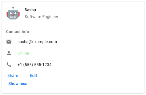
To create the sample card message in Google Chat, use the following JSON:
{ "cardsV2": [ { "cardId": "unique-card-id", "card": { "header": { "title": "Sasha", "subtitle": "Software Engineer", "imageUrl": "https://developers.google.com/workspace/chat/images/quickstart-app-avatar.png", "imageType": "CIRCLE", "imageAltText": "Avatar for Sasha" }, "sections": [ { "header": "Contact Info", "collapsible": true, "uncollapsibleWidgetsCount": 1, "widgets": [ { "decoratedText": { "startIcon": { "knownIcon": "EMAIL" }, "text": "sasha@example.com" } }, { "decoratedText": { "startIcon": { "knownIcon": "PERSON" }, "text": "<font color=&92;"#80e27e&92;">Online</font>" } }, { "decoratedText": { "startIcon": { "knownIcon": "PHONE" }, "text": "+1 (555) 555-1234" } }, { "buttonList": { "buttons": [ { "text": "Share", "onClick": { "openLink": { "url": "https://example.com/share" } } }, { "text": "Edit", "onClick": { "action": { "function": "goToView", "parameters": [ { "key": "viewType", "value": "EDIT" } ] } } } ] } } ] } ] } } ] }- header
The header of the card. A header usually contains a leading image and a title. Headers always appear at the top of a card.
- sections
Contains a collection of widgets. Each section has its own, optional header. Sections are visually separated by a line divider. For an example in Google Chat apps, see [Define a section of a card](https://developers.google.com/workspace/chat/design-components-card-dialog#define_a_section_of_a_card).
- sectionDividerStyle
The divider style between sections.
- cardActions
The card's actions. Actions are added to the card's toolbar menu. [Google Workspace Add-ons](https://developers.google.com/workspace/add-ons): For example, the following JSON constructs a card action menu with
SettingsandSend Feedbackoptions:"card_actions": [ { "actionLabel": "Settings", "onClick": { "action": { "functionName": "goToView", "parameters": [ { "key": "viewType", "value": "SETTING" } ], "loadIndicator": "LoadIndicator.SPINNER" } } }, { "actionLabel": "Send Feedback", "onClick": { "openLink": { "url": "https://example.com/feedback" } } } ]- name
Name of the card. Used as a card identifier in card navigation. [Google Workspace Add-ons](https://developers.google.com/workspace/add-ons):
- fixedFooter
The fixed footer shown at the bottom of this card. Setting
fixedFooterwithout specifying aprimaryButtonor asecondaryButtoncauses an error. For Chat apps, you can use fixed footers in [dialogs](https://developers.google.com/workspace/chat/dialogs), but not [card messages](https://developers.google.com/workspace/chat/create-messages#create). [Google Workspace Add-ons and Chat apps](https://developers.google.com/workspace/extend):- displayStyle
In Google Workspace Add-ons, sets the display properties of the
peekCardHeader. [Google Workspace Add-ons](https://developers.google.com/workspace/add-ons):- peekCardHeader
When displaying contextual content, the peek card header acts as a placeholder so that the user can navigate forward between the homepage cards and the contextual cards. [Google Workspace Add-ons](https://developers.google.com/workspace/add-ons):
- Annotations
- @SerialVersionUID()
- final case class Columns(columnItems: Seq[Column] = _root_.scala.Seq.empty, unknownFields: UnknownFieldSet = _root_.scalapb.UnknownFieldSet.empty) extends GeneratedMessage with Updatable[Columns] with Product with Serializable
The
Columnswidget displays up to 2 columns in a card or dialog.The
Columnswidget displays up to 2 columns in a card or dialog. You can add widgets to each column; the widgets appear in the order that they are specified. For an example in Google Chat apps, see [Display cards and dialogs in columns](https://developers.google.com/workspace/chat/format-structure-card-dialog#display_cards_and_dialogs_in_columns).The height of each column is determined by the taller column. For example, if the first column is taller than the second column, both columns have the height of the first column. Because each column can contain a different number of widgets, you can't define rows or align widgets between the columns.
Columns are displayed side-by-side. You can customize the width of each column using the
HorizontalSizeStylefield. If the user's screen width is too narrow, the second column wraps below the first:* On web, the second column wraps if the screen width is less than or equal to 480 pixels. * On iOS devices, the second column wraps if the screen width is less than or equal to 300 pt. * On Android devices, the second column wraps if the screen width is less than or equal to 320 dp.
To include more than 2 columns, or to use rows, use the [
Grid][google.apps.card.v1.Grid] widget.[Google Workspace Add-ons and Chat apps](https://developers.google.com/workspace/extend): Columns for Google Workspace Add-ons are in Developer Preview.
- columnItems
An array of columns. You can include up to 2 columns in a card or dialog.
- Annotations
- @SerialVersionUID()
- final case class DateTimePicker(name: String = "", label: String = "", type: DateTimePickerType = com.google.apps.card.v1.card.DateTimePicker.DateTimePickerType.DATE_AND_TIME, valueMsEpoch: Long = 0L, timezoneOffsetDate: Int = 0, onChangeAction: Option[Action] = _root_.scala.None, unknownFields: UnknownFieldSet = _root_.scalapb.UnknownFieldSet.empty) extends GeneratedMessage with Updatable[DateTimePicker] with Product with Serializable
Lets users input a date, a time, or both a date and a time.
Lets users input a date, a time, or both a date and a time. For an example in Google Chat apps, see [Let a user pick a date and time](https://developers.google.com/workspace/chat/design-interactive-card-dialog#let_a_user_pick_a_date_and_time).
Users can input text or use the picker to select dates and times. If users input an invalid date or time, the picker shows an error that prompts users to input the information correctly.
[Google Workspace Add-ons and Chat apps](https://developers.google.com/workspace/extend):
- name
The name by which the
DateTimePickeris identified in a form input event. For details about working with form inputs, see [Receive form data](https://developers.google.com/workspace/chat/read-form-data).- label
The text that prompts users to input a date, a time, or a date and time. For example, if users are scheduling an appointment, use a label such as
Appointment dateorAppointment date and time.- type
Whether the widget supports inputting a date, a time, or the date and time.
- valueMsEpoch
The default value displayed in the widget, in milliseconds since [Unix epoch time](https://en.wikipedia.org/wiki/Unix_time). Specify the value based on the type of picker (
DateTimePickerType): *DATE_AND_TIME: a calendar date and time in UTC. For example, to represent January 1, 2023 at 12:00 PM UTC, use1672574400000. *DATE_ONLY: a calendar date at 00:00:00 UTC. For example, to represent January 1, 2023, use1672531200000. *TIME_ONLY: a time in UTC. For example, to represent 12:00 PM, use43200000(or12 * 60 * 60 * 1000).- timezoneOffsetDate
The number representing the time zone offset from UTC, in minutes. If set, the
value_ms_epochis displayed in the specified time zone. If unset, the value defaults to the user's time zone setting.- onChangeAction
Triggered when the user clicks **Save** or **Clear** from the
DateTimePickerinterface.
- Annotations
- @SerialVersionUID()
- final case class DecoratedText(icon: Option[Icon] = _root_.scala.None, startIcon: Option[Icon] = _root_.scala.None, topLabel: String = "", text: String = "", wrapText: Boolean = false, bottomLabel: String = "", onClick: Option[OnClick] = _root_.scala.None, control: Control = com.google.apps.card.v1.card.DecoratedText.Control.Empty, unknownFields: UnknownFieldSet = _root_.scalapb.UnknownFieldSet.empty) extends GeneratedMessage with Updatable[DecoratedText] with Product with Serializable
A widget that displays text with optional decorations such as a label above or below the text, an icon in front of the text, a selection widget, or a button after the text.
A widget that displays text with optional decorations such as a label above or below the text, an icon in front of the text, a selection widget, or a button after the text. For an example in Google Chat apps, see [Display text with decorative text](https://developers.google.com/workspace/chat/add-text-image-card-dialog#display_text_with_decorative_elements).
[Google Workspace Add-ons and Chat apps](https://developers.google.com/workspace/extend):
- icon
Deprecated in favor of
startIcon.- startIcon
The icon displayed in front of the text.
- topLabel
The text that appears above
text. Always truncates.- text
Required. The primary text. Supports simple formatting. For more information about formatting text, see [Formatting text in Google Chat apps](https://developers.google.com/workspace/chat/format-messages#card-formatting) and [Formatting text in Google Workspace Add-ons](https://developers.google.com/apps-script/add-ons/concepts/widgets#text_formatting).
- wrapText
The wrap text setting. If
true, the text wraps and displays on multiple lines. Otherwise, the text is truncated. Only applies totext, nottopLabelandbottomLabel.- bottomLabel
The text that appears below
text. Always wraps.- onClick
This action is triggered when users click
topLabelorbottomLabel.
- Annotations
- @SerialVersionUID()
- final case class Divider(unknownFields: UnknownFieldSet = _root_.scalapb.UnknownFieldSet.empty) extends GeneratedMessage with Updatable[Divider] with Product with Serializable
Displays a divider between widgets as a horizontal line.
Displays a divider between widgets as a horizontal line. For an example in Google Chat apps, see [Add a horizontal divider between widgets](https://developers.google.com/workspace/chat/format-structure-card-dialog#add_a_horizontal_divider_between_widgets).
[Google Workspace Add-ons and Chat apps](https://developers.google.com/workspace/extend):
For example, the following JSON creates a divider:
"divider": {}- Annotations
- @SerialVersionUID()
- final case class Grid(title: String = "", items: Seq[GridItem] = _root_.scala.Seq.empty, borderStyle: Option[BorderStyle] = _root_.scala.None, columnCount: Int = 0, onClick: Option[OnClick] = _root_.scala.None, unknownFields: UnknownFieldSet = _root_.scalapb.UnknownFieldSet.empty) extends GeneratedMessage with Updatable[Grid] with Product with Serializable
Displays a grid with a collection of items.
Displays a grid with a collection of items. Items can only include text or images. For responsive columns, or to include more than text or images, use [
Columns][google.apps.card.v1.Columns]. For an example in Google Chat apps, see [Display a Grid with a collection of items](https://developers.google.com/workspace/chat/format-structure-card-dialog#display_a_grid_with_a_collection_of_items).A grid supports any number of columns and items. The number of rows is determined by items divided by columns. A grid with 10 items and 2 columns has 5 rows. A grid with 11 items and 2 columns has 6 rows.
[Google Workspace Add-ons and Chat apps](https://developers.google.com/workspace/extend):
For example, the following JSON creates a 2 column grid with a single item:
"grid": { "title": "A fine collection of items", "columnCount": 2, "borderStyle": { "type": "STROKE", "cornerRadius": 4 }, "items": [ { "image": { "imageUri": "https://www.example.com/image.png", "cropStyle": { "type": "SQUARE" }, "borderStyle": { "type": "STROKE" } }, "title": "An item", "textAlignment": "CENTER" } ], "onClick": { "openLink": { "url": "https://www.example.com" } } }- title
The text that displays in the grid header.
- items
The items to display in the grid.
- borderStyle
The border style to apply to each grid item.
- columnCount
The number of columns to display in the grid. A default value is used if this field isn't specified, and that default value is different depending on where the grid is shown (dialog versus companion).
- onClick
This callback is reused by each individual grid item, but with the item's identifier and index in the items list added to the callback's parameters.
- Annotations
- @SerialVersionUID()
- final case class Icon(icons: Icons = com.google.apps.card.v1.card.Icon.Icons.Empty, altText: String = "", imageType: ImageType = com.google.apps.card.v1.card.Widget.ImageType.SQUARE, unknownFields: UnknownFieldSet = _root_.scalapb.UnknownFieldSet.empty) extends GeneratedMessage with Updatable[Icon] with Product with Serializable
An icon displayed in a widget on a card.
An icon displayed in a widget on a card. For an example in Google Chat apps, see [Add an icon](https://developers.google.com/workspace/chat/add-text-image-card-dialog#add_an_icon).
Supports [built-in](https://developers.google.com/workspace/chat/format-messages#builtinicons) and [custom](https://developers.google.com/workspace/chat/format-messages#customicons) icons.
[Google Workspace Add-ons and Chat apps](https://developers.google.com/workspace/extend):
- altText
Optional. A description of the icon used for accessibility. If unspecified, the default value
Buttonis provided. As a best practice, you should set a helpful description for what the icon displays, and if applicable, what it does. For example,A user's account portrait, orOpens a new browser tab and navigates to the Google Chat developer documentation at https://developers.google.com/workspace/chat. If the icon is set in a [Button][google.apps.card.v1.Button], thealtTextappears as helper text when the user hovers over the button. However, if the button also setstext, the icon'saltTextis ignored.- imageType
The crop style applied to the image. In some cases, applying a
CIRCLEcrop causes the image to be drawn larger than a built-in icon.
- Annotations
- @SerialVersionUID()
- final case class Image(imageUrl: String = "", onClick: Option[OnClick] = _root_.scala.None, altText: String = "", unknownFields: UnknownFieldSet = _root_.scalapb.UnknownFieldSet.empty) extends GeneratedMessage with Updatable[Image] with Product with Serializable
An image that is specified by a URL and can have an
onClickaction.An image that is specified by a URL and can have an
onClickaction. For an example, see [Add an image](https://developers.google.com/workspace/chat/add-text-image-card-dialog#add_an_image).[Google Workspace Add-ons and Chat apps](https://developers.google.com/workspace/extend):
- imageUrl
The HTTPS URL that hosts the image. For example:
https://developers.google.com/workspace/chat/images/quickstart-app-avatar.png- onClick
When a user clicks the image, the click triggers this action.
- altText
The alternative text of this image that's used for accessibility.
- Annotations
- @SerialVersionUID()
- final case class ImageComponent(imageUri: String = "", altText: String = "", cropStyle: Option[ImageCropStyle] = _root_.scala.None, borderStyle: Option[BorderStyle] = _root_.scala.None, unknownFields: UnknownFieldSet = _root_.scalapb.UnknownFieldSet.empty) extends GeneratedMessage with Updatable[ImageComponent] with Product with Serializable
Represents an image.
Represents an image.
[Google Workspace Add-ons and Chat apps](https://developers.google.com/workspace/extend):
- imageUri
The image URL.
- altText
The accessibility label for the image.
- cropStyle
The crop style to apply to the image.
- borderStyle
The border style to apply to the image.
- Annotations
- @SerialVersionUID()
- final case class ImageCropStyle(type: ImageCropType = com.google.apps.card.v1.card.ImageCropStyle.ImageCropType.IMAGE_CROP_TYPE_UNSPECIFIED, aspectRatio: Double = 0.0, unknownFields: UnknownFieldSet = _root_.scalapb.UnknownFieldSet.empty) extends GeneratedMessage with Updatable[ImageCropStyle] with Product with Serializable
Represents the crop style applied to an image.
Represents the crop style applied to an image.
[Google Workspace Add-ons and Chat apps](https://developers.google.com/workspace/extend):
For example, here's how to apply a 16:9 aspect ratio:
cropStyle { "type": "RECTANGLE_CUSTOM", "aspectRatio": 16/9 }- type
The crop type.
- aspectRatio
The aspect ratio to use if the crop type is
RECTANGLE_CUSTOM. For example, here's how to apply a 16:9 aspect ratio:cropStyle { "type": "RECTANGLE_CUSTOM", "aspectRatio": 16/9 }
- Annotations
- @SerialVersionUID()
- final case class MaterialIcon(name: String = "", fill: Boolean = false, weight: Int = 0, grade: Int = 0, unknownFields: UnknownFieldSet = _root_.scalapb.UnknownFieldSet.empty) extends GeneratedMessage with Updatable[MaterialIcon] with Product with Serializable
A [Google Material Icon](https://fonts.google.com/icons), which includes over 2500+ options.
A [Google Material Icon](https://fonts.google.com/icons), which includes over 2500+ options.
For example, to display a [checkbox icon](https://fonts.google.com/icons?selected=Material%20Symbols%20Outlined%3Acheck_box%3AFILL%400%3Bwght%40400%3BGRAD%400%3Bopsz%4048) with customized weight and grade, write the following:
{
  "name": "check_box",
  "fill": true,
  "weight": 300,
  "grade": -25
}
[Google Chat apps](https://developers.google.com/workspace/chat):
- name
The icon name defined in the [Google Material Icon](https://fonts.google.com/icons), for example,
check_box. Any invalid names are abandoned and replaced with empty string and results in the icon failing to render.- fill
Whether the icon renders as filled. Default value is false. To preview different icon settings, go to [Google Font Icons](https://fonts.google.com/icons) and adjust the settings under **Customize**.
- weight
The stroke weight of the icon. Choose from {100, 200, 300, 400, 500, 600, 700}. If absent, default value is 400. If any other value is specified, the default value is used. To preview different icon settings, go to [Google Font Icons](https://fonts.google.com/icons) and adjust the settings under **Customize**.
- grade
Weight and grade affect a symbol’s thickness. Adjustments to grade are more granular than adjustments to weight and have a small impact on the size of the symbol. Choose from {-25, 0, 200}. If absent, default value is 0. If any other value is specified, the default value is used. To preview different icon settings, go to [Google Font Icons](https://fonts.google.com/icons) and adjust the settings under **Customize**.
- Annotations
- @SerialVersionUID()
- final case class OnClick(data: Data = com.google.apps.card.v1.card.OnClick.Data.Empty, unknownFields: UnknownFieldSet = _root_.scalapb.UnknownFieldSet.empty) extends GeneratedMessage with Updatable[OnClick] with Product with Serializable
Represents how to respond when users click an interactive element on a card, such as a button.
Represents how to respond when users click an interactive element on a card, such as a button.
[Google Workspace Add-ons and Chat apps](https://developers.google.com/workspace/extend):
- Annotations
- @SerialVersionUID()
- final case class OpenLink(url: String = "", openAs: OpenAs = com.google.apps.card.v1.card.OpenLink.OpenAs.FULL_SIZE, onClose: OnClose = com.google.apps.card.v1.card.OpenLink.OnClose.NOTHING, unknownFields: UnknownFieldSet = _root_.scalapb.UnknownFieldSet.empty) extends GeneratedMessage with Updatable[OpenLink] with Product with Serializable
Represents an
onClickevent that opens a hyperlink.Represents an
onClickevent that opens a hyperlink.[Google Workspace Add-ons and Chat apps](https://developers.google.com/workspace/extend):
- url
The URL to open.
- openAs
How to open a link. [Google Workspace Add-ons](https://developers.google.com/workspace/add-ons):
- onClose
Whether the client forgets about a link after opening it, or observes it until the window closes. [Google Workspace Add-ons](https://developers.google.com/workspace/add-ons):
- Annotations
- @SerialVersionUID()
- final case class SelectionInput(name: String = "", label: String = "", type: SelectionType = com.google.apps.card.v1.card.SelectionInput.SelectionType.CHECK_BOX, items: Seq[SelectionItem] = _root_.scala.Seq.empty, onChangeAction: Option[Action] = _root_.scala.None, multiSelectMaxSelectedItems: Int = 0, multiSelectMinQueryLength: Int = 0, multiSelectDataSource: MultiSelectDataSource = com.google.apps.card.v1.card.SelectionInput.MultiSelectDataSource.Empty, unknownFields: UnknownFieldSet = _root_.scalapb.UnknownFieldSet.empty) extends GeneratedMessage with Updatable[SelectionInput] with Product with Serializable
A widget that creates one or more UI items that users can select.
A widget that creates one or more UI items that users can select. For example, a dropdown menu or checkboxes. You can use this widget to collect data that can be predicted or enumerated. For an example in Google Chat apps, see [Add selectable UI elements](/workspace/chat/design-interactive-card-dialog#add_selectable_ui_elements).
Chat apps can process the value of items that users select or input. For details about working with form inputs, see [Receive form data](https://developers.google.com/workspace/chat/read-form-data).
To collect undefined or abstract data from users, use the [TextInput][google.apps.card.v1.TextInput] widget.
[Google Workspace Add-ons and Chat apps](https://developers.google.com/workspace/extend):
- name
The name that identifies the selection input in a form input event. For details about working with form inputs, see [Receive form data](https://developers.google.com/workspace/chat/read-form-data).
- label
The text that appears above the selection input field in the user interface. Specify text that helps the user enter the information your app needs. For example, if users are selecting the urgency of a work ticket from a drop-down menu, the label might be "Urgency" or "Select urgency".
- type
The type of items that are displayed to users in a
SelectionInputwidget. Selection types support different types of interactions. For example, users can select one or more checkboxes, but they can only select one value from a dropdown menu.- items
An array of selectable items. For example, an array of radio buttons or checkboxes. Supports up to 100 items.
- onChangeAction
If specified, the form is submitted when the selection changes. If not specified, you must specify a separate button that submits the form. For details about working with form inputs, see [Receive form data](https://developers.google.com/workspace/chat/read-form-data).
- multiSelectMaxSelectedItems
For multiselect menus, the maximum number of items that a user can select. Minimum value is 1 item. If unspecified, defaults to 3 items.
- multiSelectMinQueryLength
For multiselect menus, the number of text characters that a user inputs before the app queries autocomplete and displays suggested items in the menu. If unspecified, defaults to 0 characters for static data sources and 3 characters for external data sources.
- Annotations
- @SerialVersionUID()
- final case class Suggestions(items: Seq[SuggestionItem] = _root_.scala.Seq.empty, unknownFields: UnknownFieldSet = _root_.scalapb.UnknownFieldSet.empty) extends GeneratedMessage with Updatable[Suggestions] with Product with Serializable
Suggested values that users can enter.
Suggested values that users can enter. These values appear when users click inside the text input field. As users type, the suggested values dynamically filter to match what the users have typed.
For example, a text input field for programming language might suggest Java, JavaScript, Python, and C++. When users start typing
Jav, the list of suggestions filters to showJavaandJavaScript.Suggested values help guide users to enter values that your app can make sense of. When referring to JavaScript, some users might enter
javascriptand othersjava script. SuggestingJavaScriptcan standardize how users interact with your app.When specified,
TextInput.typeis alwaysSINGLE_LINE, even if it's set toMULTIPLE_LINE.[Google Workspace Add-ons and Chat apps](https://developers.google.com/workspace/extend):
- items
A list of suggestions used for autocomplete recommendations in text input fields.
- Annotations
- @SerialVersionUID()
- final case class TextInput(name: String = "", label: String = "", hintText: String = "", value: String = "", type: Type = com.google.apps.card.v1.card.TextInput.Type.SINGLE_LINE, onChangeAction: Option[Action] = _root_.scala.None, initialSuggestions: Option[Suggestions] = _root_.scala.None, autoCompleteAction: Option[Action] = _root_.scala.None, placeholderText: String = "", unknownFields: UnknownFieldSet = _root_.scalapb.UnknownFieldSet.empty) extends GeneratedMessage with Updatable[TextInput] with Product with Serializable
A field in which users can enter text.
A field in which users can enter text. Supports suggestions and on-change actions. For an example in Google Chat apps, see [Add a field in which a user can enter text](https://developers.google.com/workspace/chat/design-interactive-card-dialog#add_a_field_in_which_a_user_can_enter_text).
Chat apps receive and can process the value of entered text during form input events. For details about working with form inputs, see [Receive form data](https://developers.google.com/workspace/chat/read-form-data).
When you need to collect undefined or abstract data from users, use a text input. To collect defined or enumerated data from users, use the [SelectionInput][google.apps.card.v1.SelectionInput] widget.
[Google Workspace Add-ons and Chat apps](https://developers.google.com/workspace/extend):
- name
The name by which the text input is identified in a form input event. For details about working with form inputs, see [Receive form data](https://developers.google.com/workspace/chat/read-form-data).
- label
The text that appears above the text input field in the user interface. Specify text that helps the user enter the information your app needs. For example, if you are asking someone's name, but specifically need their surname, write
surnameinstead ofname. Required ifhintTextis unspecified. Otherwise, optional.- hintText
Text that appears below the text input field meant to assist users by prompting them to enter a certain value. This text is always visible. Required if
labelis unspecified. Otherwise, optional.- value
The value entered by a user, returned as part of a form input event. For details about working with form inputs, see [Receive form data](https://developers.google.com/workspace/chat/read-form-data).
- type
How a text input field appears in the user interface. For example, whether the field is single or multi-line.
- onChangeAction
What to do when a change occurs in the text input field. For example, a user adding to the field or deleting text. Examples of actions to take include running a custom function or opening a [dialog](https://developers.google.com/workspace/chat/dialogs) in Google Chat.
- initialSuggestions
Suggested values that users can enter. These values appear when users click inside the text input field. As users type, the suggested values dynamically filter to match what the users have typed. For example, a text input field for programming language might suggest Java, JavaScript, Python, and C++. When users start typing
Jav, the list of suggestions filters to show justJavaandJavaScript. Suggested values help guide users to enter values that your app can make sense of. When referring to JavaScript, some users might enterjavascriptand othersjava script. SuggestingJavaScriptcan standardize how users interact with your app. When specified,TextInput.typeis alwaysSINGLE_LINE, even if it's set toMULTIPLE_LINE. [Google Workspace Add-ons and Chat apps](https://developers.google.com/workspace/extend):- autoCompleteAction
Optional. Specify what action to take when the text input field provides suggestions to users who interact with it. If unspecified, the suggestions are set by
initialSuggestionsand are processed by the client. If specified, the app takes the action specified here, such as running a custom function. [Google Workspace Add-ons](https://developers.google.com/workspace/add-ons):- placeholderText
Text that appears in the text input field when the field is empty. Use this text to prompt users to enter a value. For example,
Enter a
  number from 0 to 100
. [Google Chat apps](https://developers.google.com/workspace/chat):
- Annotations
- @SerialVersionUID()
- final case class TextParagraph(text: String = "", unknownFields: UnknownFieldSet = _root_.scalapb.UnknownFieldSet.empty) extends GeneratedMessage with Updatable[TextParagraph] with Product with Serializable
A paragraph of text that supports formatting.
A paragraph of text that supports formatting. For an example in Google Chat apps, see [Add a paragraph of formatted text](https://developers.google.com/workspace/chat/add-text-image-card-dialog#add_a_paragraph_of_formatted_text). For more information about formatting text, see [Formatting text in Google Chat apps](https://developers.google.com/workspace/chat/format-messages#card-formatting) and [Formatting text in Google Workspace Add-ons](https://developers.google.com/apps-script/add-ons/concepts/widgets#text_formatting).
[Google Workspace Add-ons and Chat apps](https://developers.google.com/workspace/extend):
- text
The text that's shown in the widget.
- Annotations
- @SerialVersionUID()
- final case class Widget(data: Data = com.google.apps.card.v1.card.Widget.Data.Empty, horizontalAlignment: HorizontalAlignment = com.google.apps.card.v1.card.Widget.HorizontalAlignment.HORIZONTAL_ALIGNMENT_UNSPECIFIED, unknownFields: UnknownFieldSet = _root_.scalapb.UnknownFieldSet.empty) extends GeneratedMessage with Updatable[Widget] with Product with Serializable
Each card is made up of widgets.
Each card is made up of widgets.
A widget is a composite object that can represent one of text, images, buttons, and other object types.
- horizontalAlignment
Specifies whether widgets align to the left, right, or center of a column.
- Annotations
- @SerialVersionUID()
Value Members
- object Action extends GeneratedMessageCompanion[Action]
- object BorderStyle extends GeneratedMessageCompanion[BorderStyle]
- object Button extends GeneratedMessageCompanion[Button]
- object ButtonList extends GeneratedMessageCompanion[ButtonList]
- object Card extends GeneratedMessageCompanion[Card]
- object CardProto extends GeneratedFileObject
- object Columns extends GeneratedMessageCompanion[Columns]
- object DateTimePicker extends GeneratedMessageCompanion[DateTimePicker]
- object DecoratedText extends GeneratedMessageCompanion[DecoratedText]
- object Divider extends GeneratedMessageCompanion[Divider]
- object Grid extends GeneratedMessageCompanion[Grid]
- object Icon extends GeneratedMessageCompanion[Icon]
- object Image extends GeneratedMessageCompanion[Image]
- object ImageComponent extends GeneratedMessageCompanion[ImageComponent]
- object ImageCropStyle extends GeneratedMessageCompanion[ImageCropStyle]
- object MaterialIcon extends GeneratedMessageCompanion[MaterialIcon]
- object OnClick extends GeneratedMessageCompanion[OnClick]
- object OpenLink extends GeneratedMessageCompanion[OpenLink]
- object SelectionInput extends GeneratedMessageCompanion[SelectionInput]
- object Suggestions extends GeneratedMessageCompanion[Suggestions]
- object TextInput extends GeneratedMessageCompanion[TextInput]
- object TextParagraph extends GeneratedMessageCompanion[TextParagraph]
- object Widget extends GeneratedMessageCompanion[Widget]