package v1
Type Members
- final class Action extends GeneratedMessage with ActionOrBuilder
An action that describes the behavior when the form is submitted.
For example, you can invoke an Apps Script script to handle the form.
If the action is triggered, the form values are sent to the server.

[Google Workspace add-ons and Chat
apps](https://developers.google.com/workspace/extend):
An action that describes the behavior when the form is submitted.
For example, you can invoke an Apps Script script to handle the form.
If the action is triggered, the form values are sent to the server.

[Google Workspace add-ons and Chat
apps](https://developers.google.com/workspace/extend):
Protobuf type
google.apps.card.v1.Action- Annotations
- @Generated()
- trait ActionOrBuilder extends MessageOrBuilder
- Annotations
- @Generated()
- final class BorderStyle extends GeneratedMessage with BorderStyleOrBuilder
The style options for the border of a card or widget, including the border
type and color.

[Google Workspace add-ons and Chat
apps](https://developers.google.com/workspace/extend):
The style options for the border of a card or widget, including the border
type and color.

[Google Workspace add-ons and Chat
apps](https://developers.google.com/workspace/extend):
Protobuf type
google.apps.card.v1.BorderStyle- Annotations
- @Generated()
- trait BorderStyleOrBuilder extends MessageOrBuilder
- Annotations
- @Generated()
- final class Button extends GeneratedMessage with ButtonOrBuilder
A text, icon, or text and icon button that users can click. For an example in
Google Chat apps, see
[Add a
button](https://developers.google.com/workspace/chat/design-interactive-card-dialog#add_a_button).

To make an image a clickable button, specify an
[`Image`][google.apps.card.v1.Image] (not an
[`ImageComponent`][google.apps.card.v1.ImageComponent]) and set an
`onClick` action.

[Google Workspace
add-ons and Chat apps](https://developers.google.com/workspace/extend):
Protobuf type
google.apps.card.v1.Button- Annotations
- @Generated()
- final class ButtonList extends GeneratedMessage with ButtonListOrBuilder
A list of buttons layed out horizontally. For an example in
Google Chat apps, see
[Add a
button](https://developers.google.com/workspace/chat/design-interactive-card-dialog#add_a_button).

[Google Workspace add-ons and Chat
apps](https://developers.google.com/workspace/extend):
A list of buttons layed out horizontally. For an example in
Google Chat apps, see
[Add a
button](https://developers.google.com/workspace/chat/design-interactive-card-dialog#add_a_button).

[Google Workspace add-ons and Chat
apps](https://developers.google.com/workspace/extend):
Protobuf type
google.apps.card.v1.ButtonList- Annotations
- @Generated()
- trait ButtonListOrBuilder extends MessageOrBuilder
- Annotations
- @Generated()
- trait ButtonOrBuilder extends MessageOrBuilder
- Annotations
- @Generated()
- final class Card extends GeneratedMessage with CardOrBuilder
A card interface displayed in a Google Chat message or Google Workspace add-on. Cards support a defined layout, interactive UI elements like buttons, and rich media like images. Use cards to present detailed information, gather information from users, and guide users to take a next step. [Card builder](https://addons.gsuite.google.com/uikit/builder) To learn how to build cards, see the following documentation: * For Google Chat apps, see [Design the components of a card or dialog](https://developers.google.com/workspace/chat/design-components-card-dialog). * For Google Workspace add-ons, see [Card-based interfaces](https://developers.google.com/apps-script/add-ons/concepts/cards). Note: You can add up to 100 widgets per card. Any widgets beyond this limit are ignored. This limit applies to both card messages and dialogs in Google Chat apps, and to cards in Google Workspace add-ons. **Example: Card message for a Google Chat app** 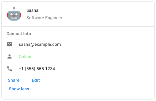 To create the sample card message in Google Chat, use the following JSON: ``` { "cardsV2": [ { "cardId": "unique-card-id", "card": { "header": { "title": "Sasha", "subtitle": "Software Engineer", "imageUrl": "https://developers.google.com/workspace/chat/images/quickstart-app-avatar.png", "imageType": "CIRCLE", "imageAltText": "Avatar for Sasha" }, "sections": [ { "header": "Contact Info", "collapsible": true, "uncollapsibleWidgetsCount": 1, "widgets": [ { "decoratedText": { "startIcon": { "knownIcon": "EMAIL" }, "text": "sasha@example.com" } }, { "decoratedText": { "startIcon": { "knownIcon": "PERSON" }, "text": "<font color=\"#80e27e\">Online</font>" } }, { "decoratedText": { "startIcon": { "knownIcon": "PHONE" }, "text": "+1 (555) 555-1234" } }, { "buttonList": { "buttons": [ { "text": "Share", "onClick": { "openLink": { "url": "https://example.com/share" } } }, { "text": "Edit", "onClick": { "action": { "function": "goToView", "parameters": [ { "key": "viewType", "value": "EDIT" } ] } } } ] } } ] } ] } } ] } ```A card interface displayed in a Google Chat message or Google Workspace add-on. Cards support a defined layout, interactive UI elements like buttons, and rich media like images. Use cards to present detailed information, gather information from users, and guide users to take a next step. [Card builder](https://addons.gsuite.google.com/uikit/builder) To learn how to build cards, see the following documentation: * For Google Chat apps, see [Design the components of a card or dialog](https://developers.google.com/workspace/chat/design-components-card-dialog). * For Google Workspace add-ons, see [Card-based interfaces](https://developers.google.com/apps-script/add-ons/concepts/cards). Note: You can add up to 100 widgets per card. Any widgets beyond this limit are ignored. This limit applies to both card messages and dialogs in Google Chat apps, and to cards in Google Workspace add-ons. **Example: Card message for a Google Chat app**  To create the sample card message in Google Chat, use the following JSON: ``` { "cardsV2": [ { "cardId": "unique-card-id", "card": { "header": { "title": "Sasha", "subtitle": "Software Engineer", "imageUrl": "https://developers.google.com/workspace/chat/images/quickstart-app-avatar.png", "imageType": "CIRCLE", "imageAltText": "Avatar for Sasha" }, "sections": [ { "header": "Contact Info", "collapsible": true, "uncollapsibleWidgetsCount": 1, "widgets": [ { "decoratedText": { "startIcon": { "knownIcon": "EMAIL" }, "text": "sasha@example.com" } }, { "decoratedText": { "startIcon": { "knownIcon": "PERSON" }, "text": "<font color=\"#80e27e\">Online</font>" } }, { "decoratedText": { "startIcon": { "knownIcon": "PHONE" }, "text": "+1 (555) 555-1234" } }, { "buttonList": { "buttons": [ { "text": "Share", "onClick": { "openLink": { "url": "https://example.com/share" } } }, { "text": "Edit", "onClick": { "action": { "function": "goToView", "parameters": [ { "key": "viewType", "value": "EDIT" } ] } } } ] } } ] } ] } } ] } ```Protobuf type
google.apps.card.v1.Card- Annotations
- @Generated()
- trait CardOrBuilder extends MessageOrBuilder
- Annotations
- @Generated()
- final class CardProto extends GeneratedFile
- Annotations
- @Generated()
- final class Carousel extends GeneratedMessage with CarouselOrBuilder
A carousel, also known as a slider, rotates and displays a list of widgets in
a slideshow format, with buttons navigating to the previous or next widget.

For example, this is a JSON representation of a carousel that contains three
text paragraph widgets.

```
{
"carouselCards": [
{
"widgets": [
{
"textParagraph": {
"text": "First text paragraph in carousel",
}
}
]
},
{
"widgets": [
{
"textParagraph": {
"text": "Second text paragraph in carousel",
}
}
]
},
{
"widgets": [
{
"textParagraph": {
"text": "Third text paragraph in carousel",
}
}
]
}
]
}
```

[Google Chat apps](https://developers.google.com/workspace/chat):
A carousel, also known as a slider, rotates and displays a list of widgets in a slideshow format, with buttons navigating to the previous or next widget. For example, this is a JSON representation of a carousel that contains three text paragraph widgets. ``` { "carouselCards": [ { "widgets": [ { "textParagraph": { "text": "First text paragraph in carousel", } } ] }, { "widgets": [ { "textParagraph": { "text": "Second text paragraph in carousel", } } ] }, { "widgets": [ { "textParagraph": { "text": "Third text paragraph in carousel", } } ] } ] } ``` [Google Chat apps](https://developers.google.com/workspace/chat):Protobuf type
google.apps.card.v1.Carousel- Annotations
- @Generated()
- trait CarouselOrBuilder extends MessageOrBuilder
- Annotations
- @Generated()
- final class Chip extends GeneratedMessage with ChipOrBuilder
A text, icon, or text and icon chip that users can click.

[Google Workspace add-ons and Chat
apps](https://developers.google.com/workspace/extend):
A text, icon, or text and icon chip that users can click.

[Google Workspace add-ons and Chat
apps](https://developers.google.com/workspace/extend):
Protobuf type
google.apps.card.v1.Chip- Annotations
- @Generated()
- final class ChipList extends GeneratedMessage with ChipListOrBuilder
A list of chips layed out horizontally, which can either scroll horizontally
or wrap to the next line.

[Google Workspace add-ons and Chat
apps](https://developers.google.com/workspace/extend):
A list of chips layed out horizontally, which can either scroll horizontally
or wrap to the next line.

[Google Workspace add-ons and Chat
apps](https://developers.google.com/workspace/extend):
Protobuf type
google.apps.card.v1.ChipList- Annotations
- @Generated()
- trait ChipListOrBuilder extends MessageOrBuilder
- Annotations
- @Generated()
- trait ChipOrBuilder extends MessageOrBuilder
- Annotations
- @Generated()
- final class CollapseControl extends GeneratedMessage with CollapseControlOrBuilder
Represent an expand and collapse control.

[Google Workspace add-ons and Chat
apps](https://developers.google.com/workspace/extend):
Represent an expand and collapse control.

[Google Workspace add-ons and Chat
apps](https://developers.google.com/workspace/extend):
Protobuf type
google.apps.card.v1.CollapseControl- Annotations
- @Generated()
- trait CollapseControlOrBuilder extends MessageOrBuilder
- Annotations
- @Generated()
- final class Columns extends GeneratedMessage with ColumnsOrBuilder
The `Columns` widget displays up to 2 columns in a card or dialog. You can
add widgets to each column; the widgets appear in the order that they are
specified. For an example in Google Chat apps, see
[Display cards and dialogs in
columns](https://developers.google.com/workspace/chat/format-structure-card-dialog#display_cards_and_dialogs_in_columns).

The height of each column is determined by the taller column. For example, if
the first column is taller than the second column, both columns have the
height of the first column. Because each column can contain a different
number of widgets, you can't define rows or align widgets between the
columns.

Columns are displayed side-by-side. You can customize the width of each
column using the `HorizontalSizeStyle` field. If the user's
screen width is too narrow, the second column wraps below the first:

* On web, the second column wraps if the screen width is less than or equal
to 480 pixels.
* On iOS devices, the second column wraps if the screen width is
less than or equal to 300 pt.
* On Android devices, the second column wraps if the screen width is
less than or equal to 320 dp.

To include more than two columns, or to use rows, use the
[`Grid`][google.apps.card.v1.Grid] widget.

[Google Workspace add-ons and Chat
apps](https://developers.google.com/workspace/extend):
The add-on UIs that support columns include:

* The dialog displayed when users open the add-on from an email draft.
* The dialog displayed when users open the add-on from the
**Add attachment** menu in a Google Calendar event.
Protobuf type
google.apps.card.v1.Columns- Annotations
- @Generated()
- trait ColumnsOrBuilder extends MessageOrBuilder
- Annotations
- @Generated()
- final class DateTimePicker extends GeneratedMessage with DateTimePickerOrBuilder
Lets users input a date, a time, or both a date and a time.
Supports form submission validation. When `Action.all_widgets_are_required`
is set to `true` or this widget is specified in `Action.required_widgets`,
the submission action is blocked unless a value is selected. For an example
in Google Chat apps, see [Let a user pick a date and
time](https://developers.google.com/workspace/chat/design-interactive-card-dialog#let_a_user_pick_a_date_and_time).

Users can input text or use the picker to select dates and times. If users
input an invalid date or time, the picker shows an error that prompts users
to input the information correctly.

[Google Workspace
add-ons and Chat apps](https://developers.google.com/workspace/extend):
Protobuf type
google.apps.card.v1.DateTimePicker- Annotations
- @Generated()
- trait DateTimePickerOrBuilder extends MessageOrBuilder
- Annotations
- @Generated()
- final class DecoratedText extends GeneratedMessage with DecoratedTextOrBuilder
A widget that displays text with optional decorations such as a label above
or below the text, an icon in front of the text, a selection widget, or a
button after the text. For an example in
Google Chat apps, see [Display text with decorative
text](https://developers.google.com/workspace/chat/add-text-image-card-dialog#display_text_with_decorative_elements).

[Google Workspace add-ons and Chat
apps](https://developers.google.com/workspace/extend):
Protobuf type
google.apps.card.v1.DecoratedText- Annotations
- @Generated()
- trait DecoratedTextOrBuilder extends MessageOrBuilder
- Annotations
- @Generated()
- final class Divider extends GeneratedMessage with DividerOrBuilder
Displays a divider between widgets as a horizontal line. For an example in
Google Chat apps, see
[Add a horizontal divider between
widgets](https://developers.google.com/workspace/chat/format-structure-card-dialog#add_a_horizontal_divider_between_widgets).

[Google Workspace add-ons and Chat
apps](https://developers.google.com/workspace/extend):

For example, the following JSON creates a divider:

```
"divider": {}
```
Displays a divider between widgets as a horizontal line. For an example in Google Chat apps, see [Add a horizontal divider between widgets](https://developers.google.com/workspace/chat/format-structure-card-dialog#add_a_horizontal_divider_between_widgets). [Google Workspace add-ons and Chat apps](https://developers.google.com/workspace/extend): For example, the following JSON creates a divider: ``` "divider": {} ```Protobuf type
google.apps.card.v1.Divider- Annotations
- @Generated()
- trait DividerOrBuilder extends MessageOrBuilder
- Annotations
- @Generated()
- final class Grid extends GeneratedMessage with GridOrBuilder
Displays a grid with a collection of items. Items can only include text or
images. For responsive columns, or to include more than text or images, use
[`Columns`][google.apps.card.v1.Columns]. For an example in Google Chat apps,
see [Display a Grid with a collection of
items](https://developers.google.com/workspace/chat/format-structure-card-dialog#display_a_grid_with_a_collection_of_items).

A grid supports any number of columns and items. The number of rows is
determined by items divided by columns. A grid with
10 items and 2 columns has 5 rows. A grid with 11 items and 2 columns
has 6 rows.

[Google Workspace add-ons and Chat
apps](https://developers.google.com/workspace/extend):

For example, the following JSON creates a 2 column grid with a single
item:

```
"grid": {
"title": "A fine collection of items",
"columnCount": 2,
"borderStyle": {
"type": "STROKE",
"cornerRadius": 4
},
"items": [
{
"image": {
"imageUri": "https://www.example.com/image.png",
"cropStyle": {
"type": "SQUARE"
},
"borderStyle": {
"type": "STROKE"
}
},
"title": "An item",
"textAlignment": "CENTER"
}
],
"onClick": {
"openLink": {
"url": "https://www.example.com"
}
}
}
```
Displays a grid with a collection of items. Items can only include text or images. For responsive columns, or to include more than text or images, use [`Columns`][google.apps.card.v1.Columns]. For an example in Google Chat apps, see [Display a Grid with a collection of items](https://developers.google.com/workspace/chat/format-structure-card-dialog#display_a_grid_with_a_collection_of_items). A grid supports any number of columns and items. The number of rows is determined by items divided by columns. A grid with 10 items and 2 columns has 5 rows. A grid with 11 items and 2 columns has 6 rows. [Google Workspace add-ons and Chat apps](https://developers.google.com/workspace/extend): For example, the following JSON creates a 2 column grid with a single item: ``` "grid": { "title": "A fine collection of items", "columnCount": 2, "borderStyle": { "type": "STROKE", "cornerRadius": 4 }, "items": [ { "image": { "imageUri": "https://www.example.com/image.png", "cropStyle": { "type": "SQUARE" }, "borderStyle": { "type": "STROKE" } }, "title": "An item", "textAlignment": "CENTER" } ], "onClick": { "openLink": { "url": "https://www.example.com" } } } ```Protobuf type
google.apps.card.v1.Grid- Annotations
- @Generated()
- trait GridOrBuilder extends MessageOrBuilder
- Annotations
- @Generated()
- final class Icon extends GeneratedMessage with IconOrBuilder
An icon displayed in a widget on a card. For an example in Google Chat apps,
see [Add an
icon](https://developers.google.com/workspace/chat/add-text-image-card-dialog#add_an_icon).

Supports
[built-in](https://developers.google.com/workspace/chat/format-messages#builtinicons)
and
[custom](https://developers.google.com/workspace/chat/format-messages#customicons)
icons.

[Google Workspace add-ons and Chat
apps](https://developers.google.com/workspace/extend):
Protobuf type
google.apps.card.v1.Icon- Annotations
- @Generated()
- trait IconOrBuilder extends MessageOrBuilder
- Annotations
- @Generated()
- final class Image extends GeneratedMessage with ImageOrBuilder
An image that is specified by a URL and can have an `onClick` action. For an
example, see [Add an
image](https://developers.google.com/workspace/chat/add-text-image-card-dialog#add_an_image).

[Google Workspace add-ons and Chat
apps](https://developers.google.com/workspace/extend):
An image that is specified by a URL and can have an `onClick` action. For an
example, see [Add an
image](https://developers.google.com/workspace/chat/add-text-image-card-dialog#add_an_image).

[Google Workspace add-ons and Chat
apps](https://developers.google.com/workspace/extend):
Protobuf type
google.apps.card.v1.Image- Annotations
- @Generated()
- final class ImageComponent extends GeneratedMessage with ImageComponentOrBuilder
Represents an image.

[Google Workspace add-ons and Chat
apps](https://developers.google.com/workspace/extend):
Represents an image.

[Google Workspace add-ons and Chat
apps](https://developers.google.com/workspace/extend):
Protobuf type
google.apps.card.v1.ImageComponent- Annotations
- @Generated()
- trait ImageComponentOrBuilder extends MessageOrBuilder
- Annotations
- @Generated()
- final class ImageCropStyle extends GeneratedMessage with ImageCropStyleOrBuilder
Represents the crop style applied to an image.

[Google Workspace add-ons and
Chat apps](https://developers.google.com/workspace/extend):

For example, here's how to apply a 16:9 aspect ratio:

```
cropStyle {
"type": "RECTANGLE_CUSTOM",
"aspectRatio": 16/9
}
```
Represents the crop style applied to an image. [Google Workspace add-ons and Chat apps](https://developers.google.com/workspace/extend): For example, here's how to apply a 16:9 aspect ratio: ``` cropStyle { "type": "RECTANGLE_CUSTOM", "aspectRatio": 16/9 } ```Protobuf type
google.apps.card.v1.ImageCropStyle- Annotations
- @Generated()
- trait ImageCropStyleOrBuilder extends MessageOrBuilder
- Annotations
- @Generated()
- trait ImageOrBuilder extends MessageOrBuilder
- Annotations
- @Generated()
- final class MaterialIcon extends GeneratedMessage with MaterialIconOrBuilder
A [Google Material Icon](https://fonts.google.com/icons), which includes over
2500+ options.

For example, to display a [checkbox
icon](https://fonts.google.com/icons?selected=Material%20Symbols%20Outlined%3Acheck_box%3AFILL%400%3Bwght%40400%3BGRAD%400%3Bopsz%4048)
with customized weight and grade, write the following:

```
{
"name": "check_box",
"fill": true,
"weight": 300,
"grade": -25
}
```

[Google Chat apps](https://developers.google.com/workspace/chat):
A [Google Material Icon](https://fonts.google.com/icons), which includes over 2500+ options. For example, to display a [checkbox icon](https://fonts.google.com/icons?selected=Material%20Symbols%20Outlined%3Acheck_box%3AFILL%400%3Bwght%40400%3BGRAD%400%3Bopsz%4048) with customized weight and grade, write the following: ``` { "name": "check_box", "fill": true, "weight": 300, "grade": -25 } ``` [Google Chat apps](https://developers.google.com/workspace/chat):Protobuf type
google.apps.card.v1.MaterialIcon- Annotations
- @Generated()
- trait MaterialIconOrBuilder extends MessageOrBuilder
- Annotations
- @Generated()
- final class OnClick extends GeneratedMessage with OnClickOrBuilder
Represents how to respond when users click an interactive element on
a card, such as a button.

[Google Workspace add-ons and Chat
apps](https://developers.google.com/workspace/extend):
Represents how to respond when users click an interactive element on
a card, such as a button.

[Google Workspace add-ons and Chat
apps](https://developers.google.com/workspace/extend):
Protobuf type
google.apps.card.v1.OnClick- Annotations
- @Generated()
- trait OnClickOrBuilder extends MessageOrBuilder
- Annotations
- @Generated()
- final class OpenLink extends GeneratedMessage with OpenLinkOrBuilder
Represents an `onClick` event that opens a hyperlink.

[Google Workspace add-ons and Chat
apps](https://developers.google.com/workspace/extend):
Represents an `onClick` event that opens a hyperlink.

[Google Workspace add-ons and Chat
apps](https://developers.google.com/workspace/extend):
Protobuf type
google.apps.card.v1.OpenLink- Annotations
- @Generated()
- trait OpenLinkOrBuilder extends MessageOrBuilder
- Annotations
- @Generated()
- final class OverflowMenu extends GeneratedMessage with OverflowMenuOrBuilder
A widget that presents a pop-up menu with one or more actions that users can
invoke. For example, showing non-primary actions in a card. You can use this
widget when actions don't fit in the available space. To use, specify this
widget in the `OnClick` action of widgets that support it. For example, in a
`Button`.

[Google Workspace add-ons and Chat
apps](https://developers.google.com/workspace/extend):
Protobuf type
google.apps.card.v1.OverflowMenu- Annotations
- @Generated()
- trait OverflowMenuOrBuilder extends MessageOrBuilder
- Annotations
- @Generated()
- final class SelectionInput extends GeneratedMessage with SelectionInputOrBuilder
A widget that creates one or more UI items that users can select.
Supports form submission validation for `dropdown` and `multiselect` menus
only. When `Action.all_widgets_are_required` is set to `true` or this widget
is specified in `Action.required_widgets`, the submission action is blocked
unless a value is selected. For example, a dropdown menu or checkboxes. You
can use this widget to collect data that can be predicted or enumerated. For
an example in Google Chat apps, see [Add selectable UI
elements](/workspace/chat/design-interactive-card-dialog#add_selectable_ui_elements).

Chat apps can process the value of items that users select or input. For
details about working with form inputs, see [Receive form
data](https://developers.google.com/workspace/chat/read-form-data).

To collect undefined or abstract data from users, use
the [TextInput][google.apps.card.v1.TextInput] widget.

[Google Workspace add-ons
and Chat apps](https://developers.google.com/workspace/extend):
Protobuf type
google.apps.card.v1.SelectionInput- Annotations
- @Generated()
- trait SelectionInputOrBuilder extends MessageOrBuilder
- Annotations
- @Generated()
- final class Suggestions extends GeneratedMessage with SuggestionsOrBuilder
Suggested values that users can enter. These values appear when users click
inside the text input field. As users type, the suggested values
dynamically filter to match what the users have typed.

For example, a text input field for programming language might suggest
Java, JavaScript, Python, and C++. When users start typing `Jav`, the list
of suggestions filters to show `Java` and `JavaScript`.

Suggested values help guide users to enter values that your app can make
sense of. When referring to JavaScript, some users might enter `javascript`
and others `java script`. Suggesting `JavaScript` can standardize how users
interact with your app.

When specified, `TextInput.type` is always `SINGLE_LINE`, even if it's set
to `MULTIPLE_LINE`.

[Google Workspace
add-ons and Chat apps](https://developers.google.com/workspace/extend):
Protobuf type
google.apps.card.v1.Suggestions- Annotations
- @Generated()
- trait SuggestionsOrBuilder extends MessageOrBuilder
- Annotations
- @Generated()
- final class TextInput extends GeneratedMessage with TextInputOrBuilder
A field in which users can enter text. Supports suggestions and on-change
actions.
Supports form submission validation. When `Action.all_widgets_are_required`
is set to `true` or this widget is specified in `Action.required_widgets`,
the submission action is blocked unless a value is entered. For an example in
Google Chat apps, see [Add a field in which a user can enter
text](https://developers.google.com/workspace/chat/design-interactive-card-dialog#add_a_field_in_which_a_user_can_enter_text).

Chat apps receive and can process the value of entered text during form input
events. For details about working with form inputs, see [Receive form
data](https://developers.google.com/workspace/chat/read-form-data).

When you need to collect undefined or abstract data from users,
use a text input. To collect defined or enumerated data from users, use the
[SelectionInput][google.apps.card.v1.SelectionInput] widget.

[Google Workspace add-ons and Chat
apps](https://developers.google.com/workspace/extend):
Protobuf type
google.apps.card.v1.TextInput- Annotations
- @Generated()
- trait TextInputOrBuilder extends MessageOrBuilder
- Annotations
- @Generated()
- final class TextParagraph extends GeneratedMessage with TextParagraphOrBuilder
A paragraph of text that supports formatting. For an example in
Google Chat apps, see [Add a paragraph of formatted
text](https://developers.google.com/workspace/chat/add-text-image-card-dialog#add_a_paragraph_of_formatted_text).
For more information
about formatting text, see
[Formatting text in Google Chat
apps](https://developers.google.com/workspace/chat/format-messages#card-formatting)
and
[Formatting
text in Google Workspace
add-ons](https://developers.google.com/apps-script/add-ons/concepts/widgets#text_formatting).

[Google Workspace add-ons and
Chat apps](https://developers.google.com/workspace/extend):
Protobuf type
google.apps.card.v1.TextParagraph- Annotations
- @Generated()
- trait TextParagraphOrBuilder extends MessageOrBuilder
- Annotations
- @Generated()
- final class Validation extends GeneratedMessage with ValidationOrBuilder
Represents the necessary data for validating the widget it's attached to.

[Google Workspace add-ons and Chat
apps](https://developers.google.com/workspace/extend):
Represents the necessary data for validating the widget it's attached to.

[Google Workspace add-ons and Chat
apps](https://developers.google.com/workspace/extend):
Protobuf type
google.apps.card.v1.Validation- Annotations
- @Generated()
- trait ValidationOrBuilder extends MessageOrBuilder
- Annotations
- @Generated()
- final class Widget extends GeneratedMessage with WidgetOrBuilder
Each card is made up of widgets.

A widget is a composite object that can represent one of text, images,
buttons, and other object types.
Each card is made up of widgets.

A widget is a composite object that can represent one of text, images,
buttons, and other object types.
Protobuf type
google.apps.card.v1.Widget- Annotations
- @Generated()
- trait WidgetOrBuilder extends MessageOrBuilder
- Annotations
- @Generated()